


New logo for the City of Warsaw
Warsaw had two logos: the promotional logo with the “Fall in Love with Warsaw” catchphrase, and the traditional city crest. Both based on the symbol of Warsaw—the mermaid.
What to use when and how to use the crest created a lot of misunderstandings. And the “Fall in Warsaw” slogan became increasingly difficult to use in the times of COVID and war in Ukraine…
Enter the new Warsaw Mermaid! One logo to rule them all, based on the historic symbol but versatile and legible in small sizes.
What to use when and how to use the crest created a lot of misunderstandings. And the “Fall in Warsaw” slogan became increasingly difficult to use in the times of COVID and war in Ukraine…
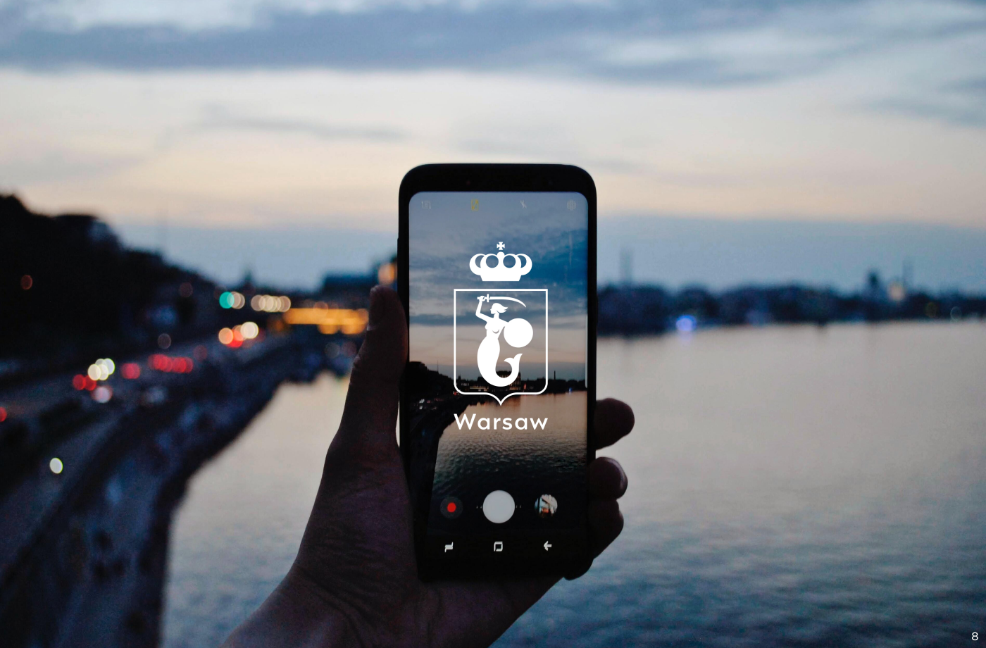
Enter the new Warsaw Mermaid! One logo to rule them all, based on the historic symbol but versatile and legible in small sizes.


The system
One logo to rule them all
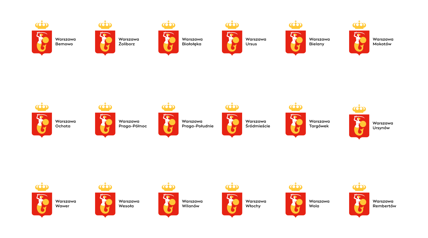
After workshops with 18 city districts and 48 institutions, it became clear that a consistent branded house approach is the way to go in Warsaw. Now citizens will not have to second guess and wonder, which information comes from the City Hall…
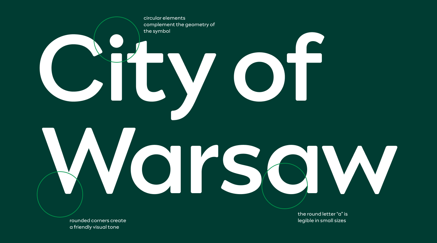
The Engram Warsaw typeface
We asked Mateusz Machalski to prepare a customised version of his Engram font. It has been adjusted in terms of accessibility and licensing terms to suit the needs of the City.
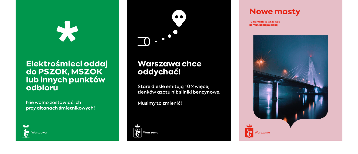
Consistent layouts
One does not simply put a new logo in the corner to make Warsaw communication consistent.
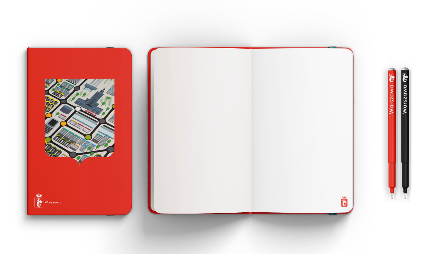
We created a versatile system of layouts for the range of City Hall promotional and information communication.

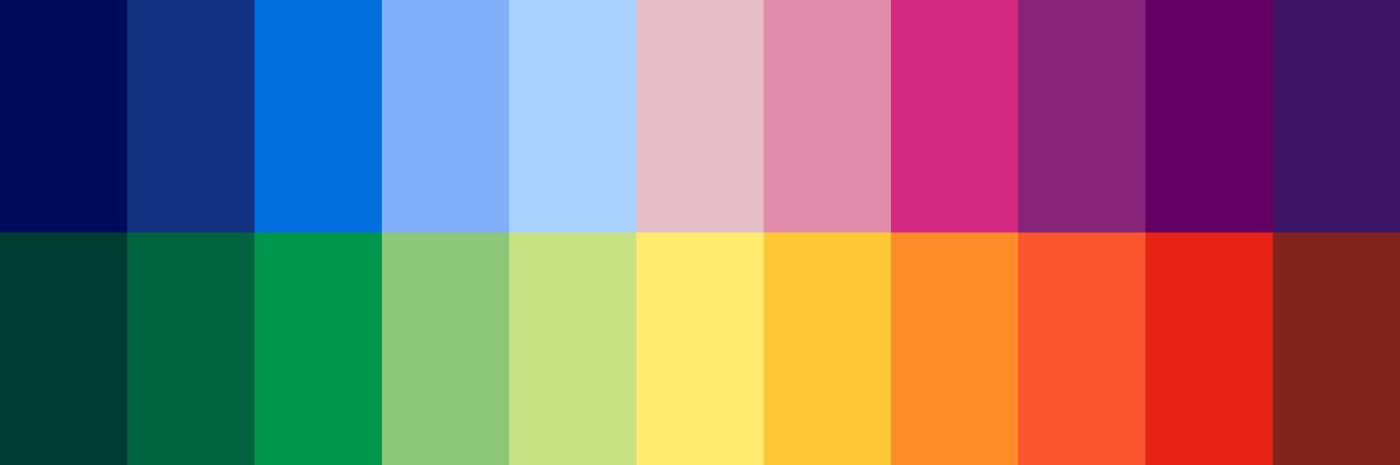
Color palette
How many colors do you need to fit the whole City of Warsaw? Answer: 28 plus GOLD :)
We based the palette on the city’s traditional colors: yellow and red.


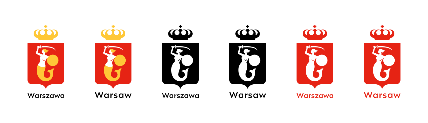
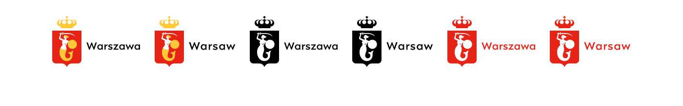
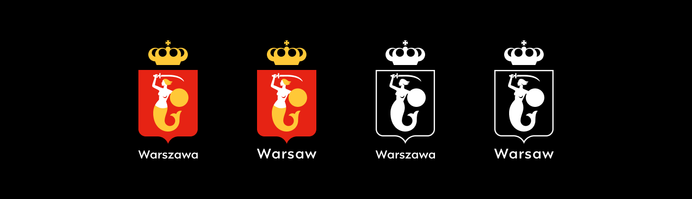
The logo
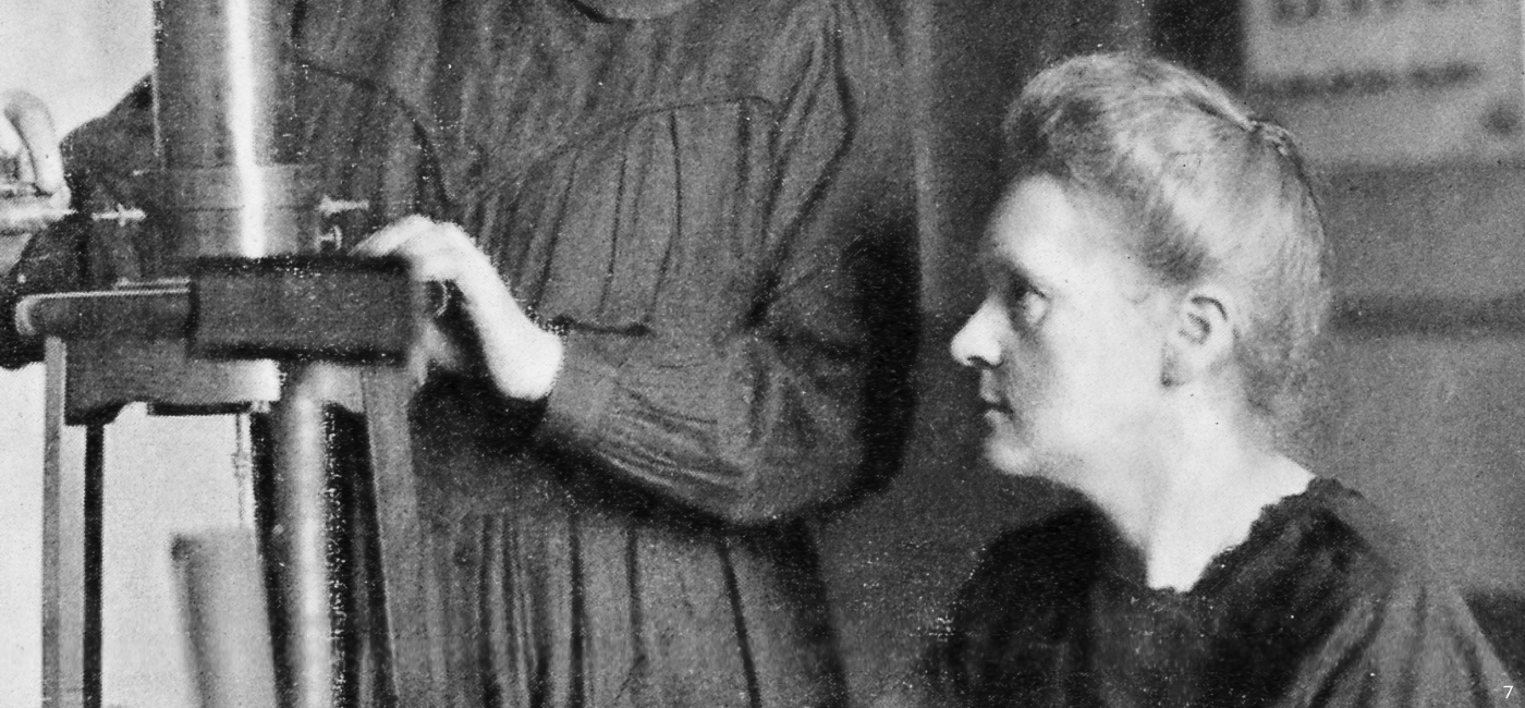
Maria Skłodowska-Curie’s profile
We wanted to memorise an inspiring female role model from Warsaw—and Maria quickly sprang to mind. We like that the mermaid has the features of a woman known throughout the world for her passion and interests (not only a pretty face).
Structure & grid
The logo is based on circles, geometric shapes, a pixel-ready grid and a touch of human imperfection…
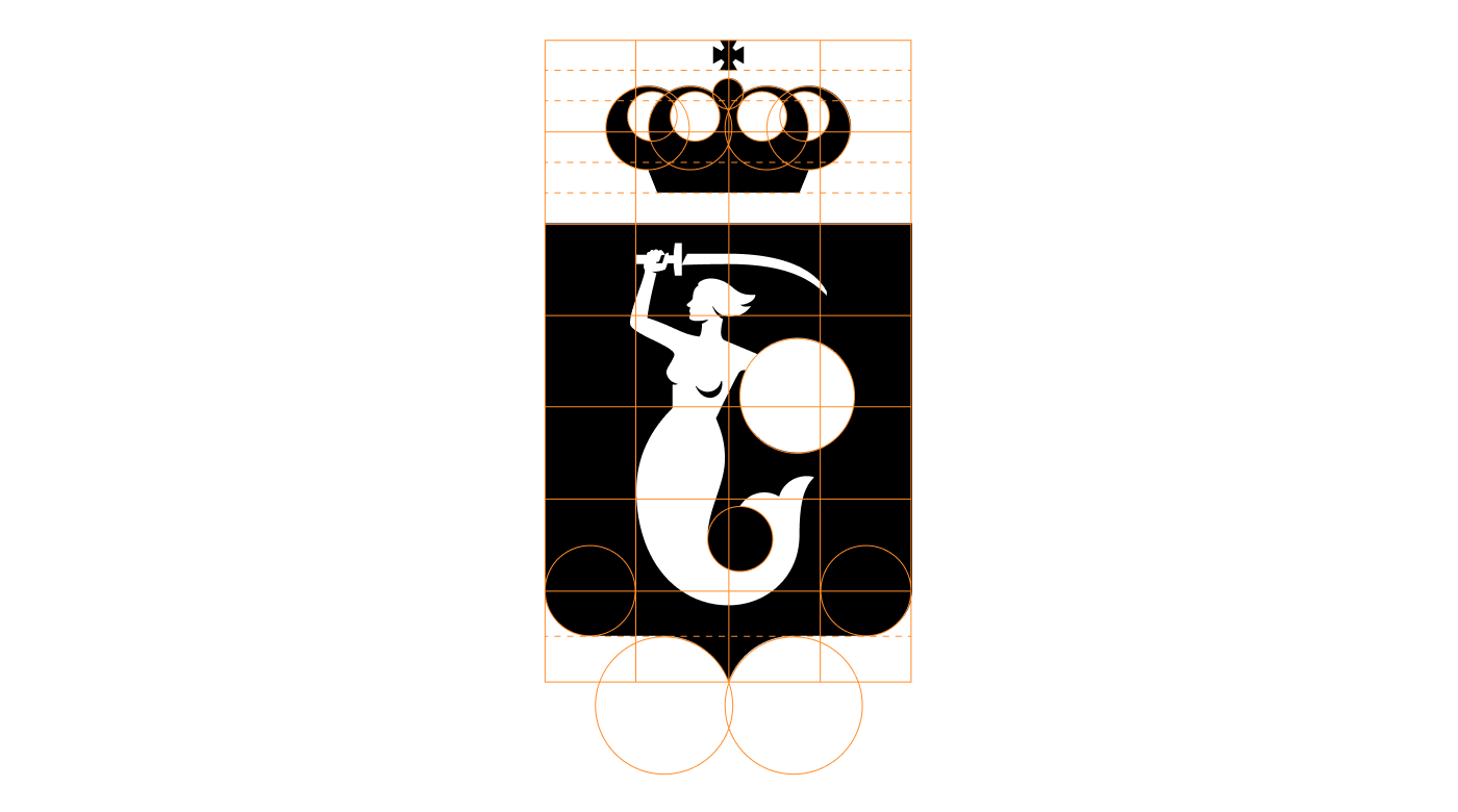
Love is in the details
The form of the hand clutching a sword, the geometry of the crown, the historic accuracy of the mermaid’s weapon—we worked hard to get the small things right…
Versions
The logo comes in Polish, English, horizontal, vertical, and 4 color versions to choose from.

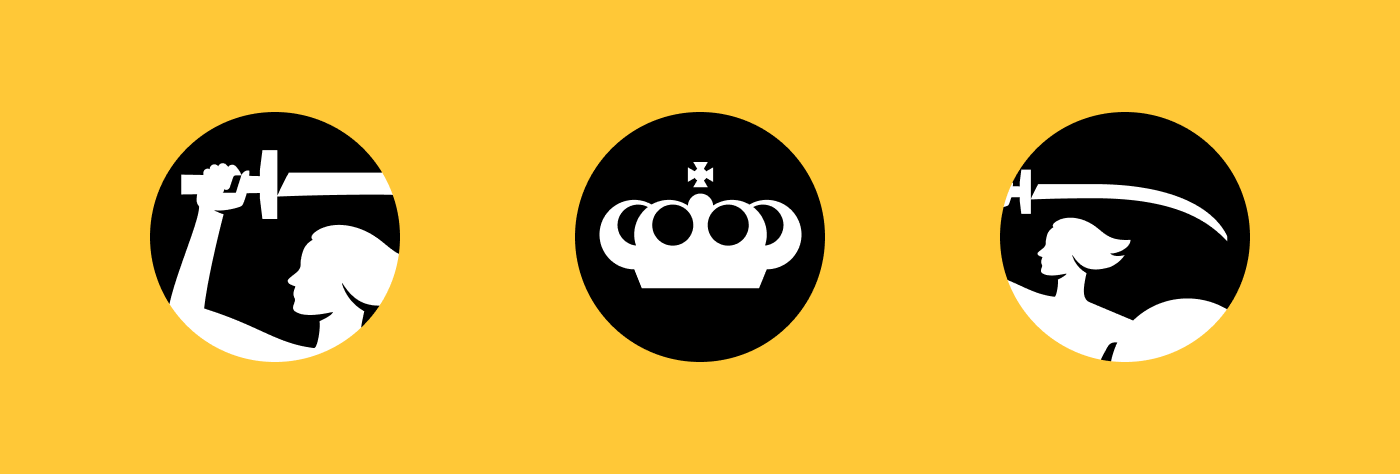
Icons
In the age of mobile everything, the round icon might be one of the first points of contact with the audience…

Concept & Design: Emilka Bojańczyk / Podpunkt
Graphic consultants: Anna Światłowska (the Museum of Warsaw), Mateusz Machalski
Font: Engram Warsaw by Mateusz Machalski
Client: City of Warsaw
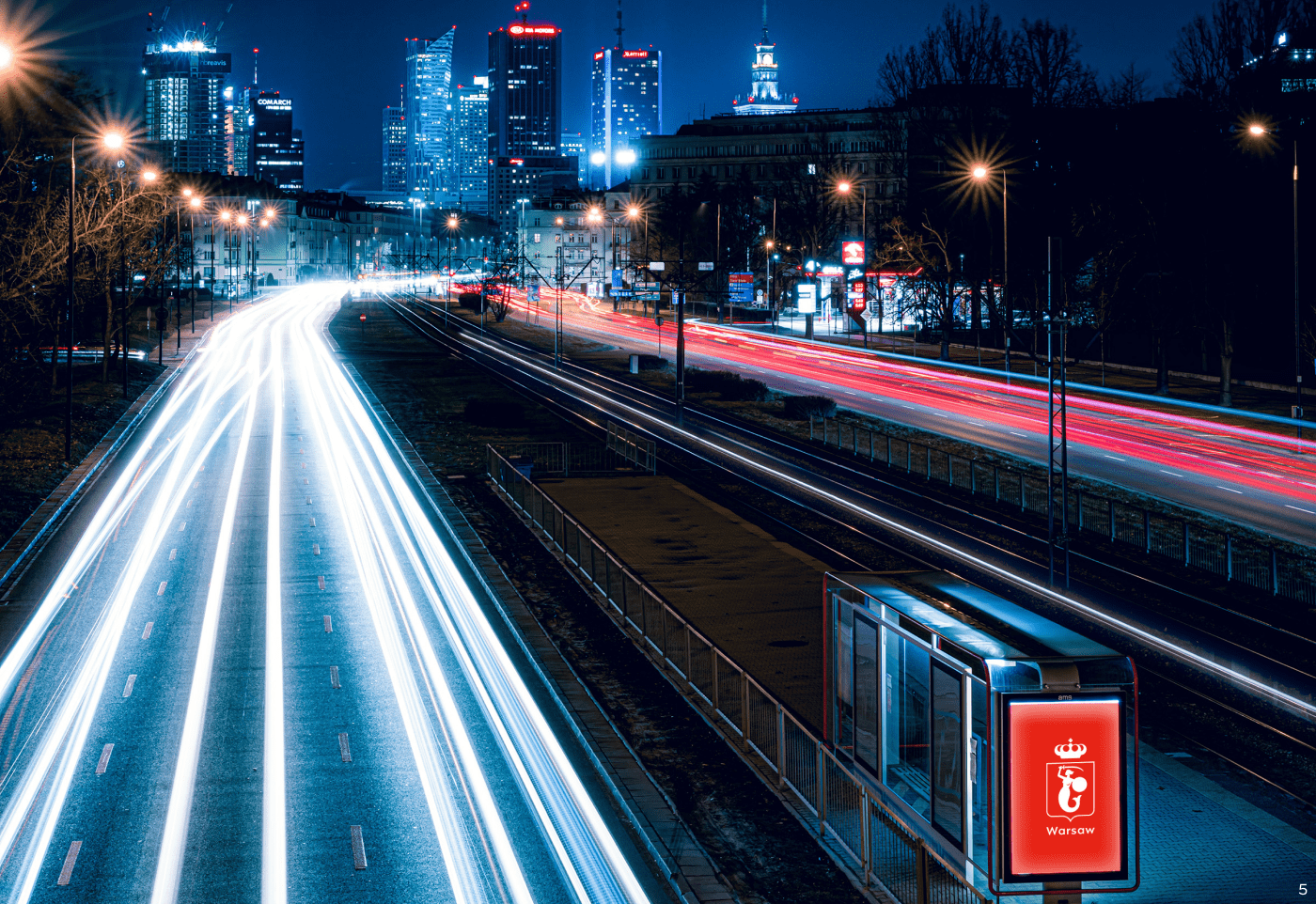
Photo: 1. Zhi Xuan Hew; 2.Fred Romero / Flickr; 3–4. © The Museum of Warsaw; 5. Adam Borkowski / Unsplah; 6. M. Czechowicz; 7. © Wikipedia 8. Valentyn Chernetskyi / Unsplash
•
Visually strong and well made products by
podpunkt.pl / superskrypt.pl


